Categorical Data
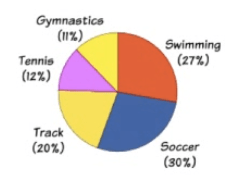
Pie Charts
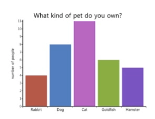
Bar Graphs
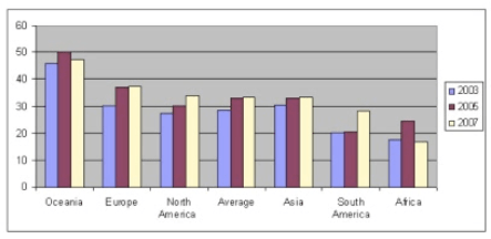
Comparative Bar Graphs
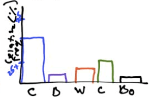
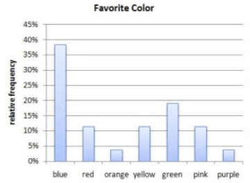
Relative Frequency Bar Graphs
Numerical Data (Discrete)
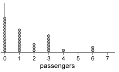
Dot Plots
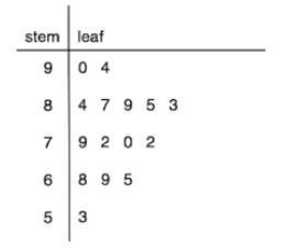
Stem (and leaf) plots
Numerical Data (Continuous)
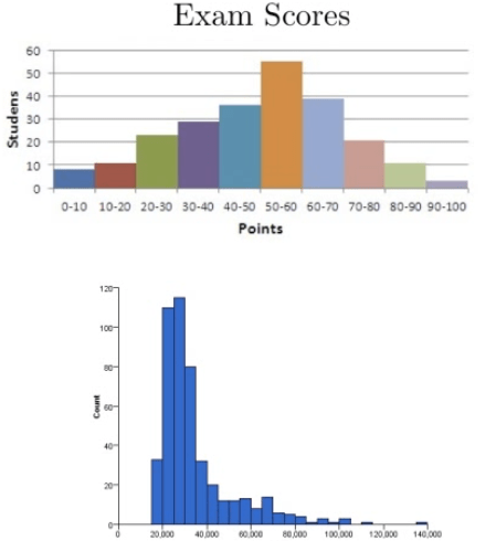
Histogram
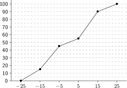
Numerical Data (Cumulative Frequency Plots)
Frequency Polygon
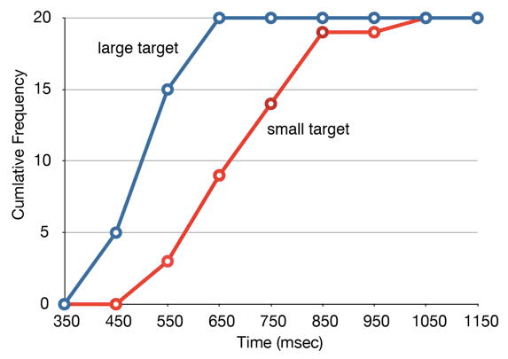
Ogive Plot
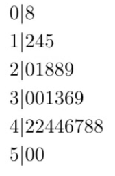
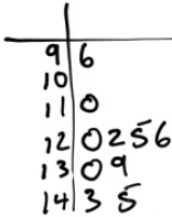
Stem Plots to Compare Two Groups of Data
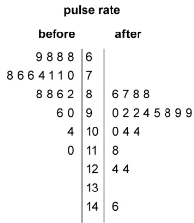
Compare the distribution pulse rate before and after administering a new drug
- After
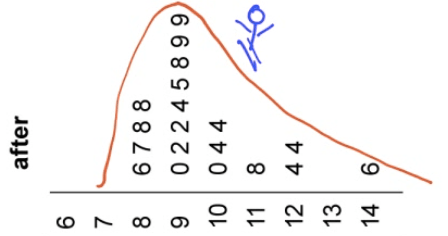
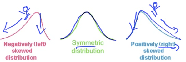
Skewed right
An outlier at 146
Centered around 95
Spread between 86 and 146
Range of 60
Before
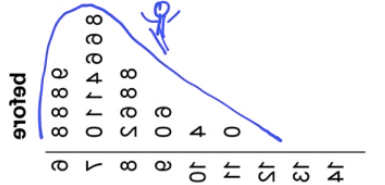
Skew right
No outliers
Lower center at around 70
Spread between 68 to 110
Smaller range of 42
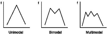
Describe the Distribution
Shape (only for numerical data)
Examples
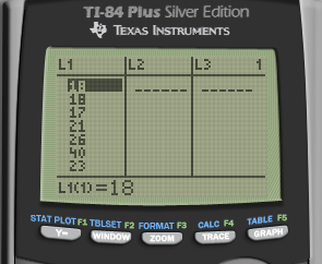
Make a stem plot of the ages in a college classroom 18, 18, 17, 21, 26, 40, 23
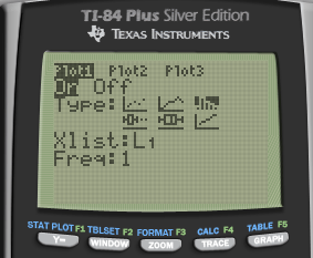
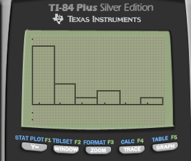
Use your calculator to make a histogram of ages in a college classroom 18, 18, 17, 21, 26, 40, 23, 27, 22, 19, 20, 21, 18, 35, 32
- STAT ➡️ EDIT ➡️ Enter & Type in the data
STAT PLOT (2ND + Y=) Turn on & Select the type
Zoom + 9
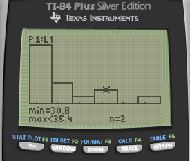
TRACE
Describe the distribution of the graph above
- skew right
Students took a statistic quiz. The score for the quiz are below. Describe the distribution of the quiz scores
Slightly skewed left
No outliers
Centered around 42
Spread of 8 to 50
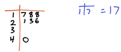
Here are the IQ test scores of a few students. Make a stem plot of these scores.
145 139 126 122 125 130 96 110 120 143
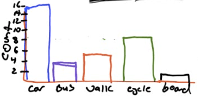
You are interested in how students in your class get to school in the morning. You take a survey and collect the following data:
Car 15, Bus 3, Walk 5, Bicycle 8, Skateboard 1
Construct a bar graph of your data
Construct a relative frequency bar graph